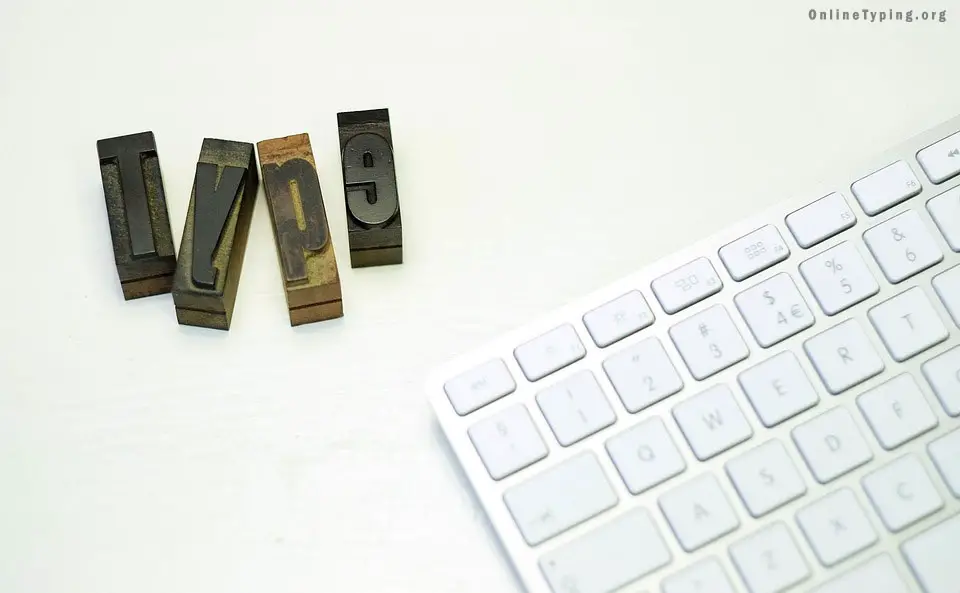
Uses of typography and typography fonts in a design.

One of the main ingredients of design is typography fonts. The typeface is very important for every designer. Having the complete knowledge of typography can uplift your designing skill. If you are a designer it is very important to know when you should apply what type font.
Generally, typeface named after its designer or its uses. For example, Baskerville, Goudy, Bodoni these fonts are named on their original designer and Times Roman was designed for the London Times.

To understand the typeface you have to know these things.
x-height: The height of the lower case letters. Here the height of "n", "e".
Ascender: The stroke of a letter, which rises above the Mean line. Here the upper part of "l" or "i".
Descender: The stroke of a letter, which hangs below the baseline. Such as "y" or "p"
Mean line: The line, which determines the height of lowercase letters.
Baseline: The imaginary line on which all characters rest.
Body size: Size of the type being used; measured from the end of the ascender to the end of the descender.
Set width: The space allowed for each letter, which may vary between letters.
Cap line: The height of the capital letters. Depending on the font cap line may taller, shorter or same height as ascender line.
Also, you have to know the uses of spacing. Leading, Kerning, and Tracking are the 3 key elements to decorate content.

Leading: Leading is the space added between two lines of a paragraph, to space out text and provide visual separation of the lines. To get a good design keep leading 20% greater than the font size.
Kerning: It refers to the distance between two letters. Adjusting the proper kerning is very important because it would be difficult to read if the kerning set too low.
Tracking: Sometimes it is difficult to find the difference between kerning and tracking. As I already mentioned that kerning is the distance between two letters, tracking also does the same thing but it involves adjusting the spacing to an entire word. You may say that Tracking is the space between two words.
Leading, Kerning, and Tracking are measured in points and fractions. To make a good design it is necessary to understand these things. Hope you now understand the typography. If you have any question please write in the comment section.
